Friday, August 2, 2013

Project Life July 15-21

I had more than enough pics for this week and it was so much fun to put together! I'm going to have to invest in some more small page protectors from Michael's. I'm going through these puppies faster than I thought I would! I know I keep saying it, but it bears repeating. I LOVE this style of Project Life (the original style, that is) because I can use so many pictures for one week instead of only one per day which was what I was doing. So glad I broke out of my boring mold!!

I always start out with some randoms for the week, Facebook statuses, crazy pics, etc. I made Bailey a hair clip out of paper flowers and she loved it. I had to get a picture of that before she took it out, which NEVER happened! I was shocked! I also had one of those "let go" moments where I handed my special camera over to her out of desperation and it turns out she can take some pretty neat photos. I need to let go more often...

This pretty much says it all. I am so entertained by this child.

I was very impressed, not only with our teamwork in meter reading, but in Morgan's ability to down an Otter Pop without ever having one before. She was a serious pro...and no drips at all. :0

This Design G insert was all about Matt's birthday dinner at Gulfstream. It was so good and Bailey had a blast. Morgan was fussy, but it doesn't show here. ;)


The back of that insert was all about concerts in the park, as always. The girls were SO pretty this night, I loved watching them play and I got some great shots that evening. Winner!

This was an Instagram collage I had posted, it was just too cute. I've found that it's very helpful to my PL when I happen to post an Instagram collage that week. It knocks out a few pics in the space of one, haha!

I love the Design I insert for when you just need to add a little something. It's also perfect for Instagram photos since they're squares. So much versatility. I made a 4X7 print of the girls, printed it on a 5X7, trimmed and split it. I've always loved when people have done the split photo, and it's hard to make sure nothing crucial is cut through, like Morgan's eyes! This is why there's a space at the top. I just backed it up with a colorful PL card and put a sticker on it. ;)
This is the back of that insert, I just printed some pics I liked and backed them up with some journal cards. I am not happy with the caption on the top photo, but I tried so many times to print it correctly and finally gave up. Every once in awhile, I'll come across some random Photoshop glitch or my own brain glitch that prevents a card from printing correctly. Oh well. I'm over it.

This page was completely devoted to our friends' birthday party. There were just so many great pictures of the girls (especially Morgan, Bailey was playing too much to get a good shot!) that I had to devote the entire last page to it. It was a Dr. Seuss themed party, so I made the image on the top from searching on Google and also finding a good font. My new favorite thing to do it go to 1001fonts.com and search for a themed font when I need it. It's addicting!


Saturday, July 20, 2013

Cigar Boxes #4

The box for my sister-in-law was very simple. I found out her favorite color was teal green, so I went with it and threw in my own ideas...

I bought a little white picket fence from Michael's and thought it would be a cute framework for some colorful layered flowers and a butterfly...

The bottom was lined in black felt, and the edges were matching pink paper. I used a photo of her grandsons and added some ornate photo corners and paper flowers, and edged the whole thing with black satin ribbon. I wasn't happy with how the ribbon turned out, I would have done that differently.

I really like tearing paper. I think it looks neat!

Cigar Boxes #3

At some point, I stopped doing the boxes in order and just worked on them as inspiration struck. I'll just list them now in no particular order. This time, I'll feature my brother's...

He is an ever-changing soul, but what I knew about his interests was that he was very into the Pirates of the Carribbean, and that he had started his own online clothing business where he created handmade items. I went with this:

Again, I don't remember what paper I used. I randomly found the netting in a Lego set my daughter was playing with, cut it up, glued it down. I downloaded the font and printed up the title myself, crinkled it up, inked the edges, then used Triple Thick to make it thick and glossy.

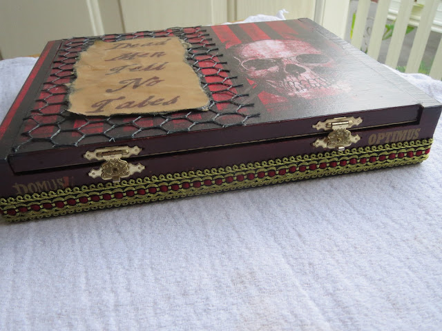
The cigar names seemed to be fitting and I could not get around those brass latches, so I opted for a trim I found at JoAnn Fabrics and thought it was pirate-y.

This was the bottom of the box. Not too fancy, just inked the edges of a paper I found in my Tattered Time stack.

This is where the scavenger hunt begins! My husband found a pair of small golden scissors at his work that nobody was using, my mom found spool labels and a large needle from my grandmother's stash, the button and screws were from my own junk drawers. Also, the Tim Holtz ruler ribbon was a nice touch.

Inside was felt lined, and I think it all came together nicely and the color scheme all came together. Whew!

Cigar Boxes #2

The next box I made was my mom's. Again, I was aiming for personal, but still more on the artsy side. She's a photographer and loves vintage medical devices and unusual phemonema.

As I said before, I don't remember the paper I used, but I did use Tim Holtz filmstrip ribbon and also bent up some stickers from his collection to represent vintage photos. Looking back, I wished I would have found original family photos for this, but I was early in my game and went with the easy route.

This was a huge pain in the butt. I cut up the little pics that come on the folio card when you order prints and glued them on to the back of the filmstrip ribbon with glue. Turned out looking pretty neat, but WAY too much work!

I lined the inside with felt and made the theme a sort of photo/medical mishmash. I used a Tim Holtz bottle and rolled up the filmstrip ribbon on the inside, then just decorated the lid with various cutouts from Graphic 45 Olde Curiosity Shoppe.


Project Life July 8-14

I started out this week thinking it was a pretty boring week, and ended up with more than enough pics! The best part about this style of PL is that if there are LOTS of pics, add more inserts. If there's a LACK of pics, add some filler cards. Easy peasy. I also have my system down. 

Sunday night I make 5 lists:
1. Facebook posts
2. Instagram pics
3. iPod pics
4. camera pics
5. mementos (haven't had any of these yet)

Then, I use tons of post-its and stick them all over my blank page protectors until I get a pretty decent rough draft. Hopefully, I can also order my prints then as well. I use Photoshop Elements to resize any pic I need onto a 4X6 template so I can send them to Costco.


Monday night (if all goes well) I get my prints and print up my journal cards. Last week I measured and used trial and error to print on them directly. This week, I scanned each journal card and typed directly on that image, deleted that layer, put the card in the printer and Voila! Instant journal card and MUCH easier! So without further ado...

More super random pics from the week, Bailey feeding her sister bath water, a water drop that looks like Mickey Mouse, "art" time at home, Morgan with her giant monster hands...

I kept with my circled calendar theme. I like it. I have them all cut out for the rest of the year!

This was the first time I scanned the card and printed on it. See how perfectly it came out next to the pic? I'm happy how it came out.
This Design G insert (I unknowingly used it upside down) was entirely devoted to Concerts in the Park. I love how colorful it turned it out because of the girls' clothes!
The back of the insert was all about our backyard and garden. Our pumpkin finally started growing, so exciting! The other pumpkin was especially helpful this day. ;)
This pretty much says it all...again, I scanned the card and printed on it from Photoshop.
The last page was more random photos from the weekend. For the bottom pic of Bailey doing her "hip hop poses" I cut up a 3X4 journal card and spaced it out between the pics.
Another cute memory from an Instagram pic. :)

Project Life July 1-7

I have been working on Project Life since May 2012, but my style was very different then. I did the photo/journal card for every day, like a real journal, but after awhile it got tedious and I ended up writing my journal cards all at the end of the month and they were VERY boring. I also found myself forcing a picture a day, even if nothing was happening. I never bought a Project Life core kit, I made everything myself. I felt that the creative freedom of the original Project Life was too stressful for me.

I changed my mind.

Beginning July 1, 2013, I bought myself the Kraft core kit at Michael's. I decided to go the traditional route and do a layout a week, adding inserts if necessary. No pressure to record EVERY day, just collect the pics, quotes, stories, etc. from that entire week and make a collection out if it. Turns out it is WAY more fun this way...

Bear with me, I have yet to get a decent pic of my layouts, but I'll keep trying. Until I perfect them, here's my first week:

I use Becky Higgins' Design A as my base, then add inserts as needed.

I found this neat calendar freebie and stuck it on there with some washi, very basic.
I discovered a painting by Mary Cassatt this week and thought it was very fitting and beautiful, so I put it in here. I also go through my Facebook posts each week using my Momento app and see if there's any Bailey quotes that need to be included. I chose to use NONE of my own handwriting in my new PL book, so I print everything out directly on the journal cards. Because my handwriting is very erratic, I think it looks SO much cleaner now!
I found these Facebook printables and thought they were perfect for me, since I LIVE on Facebook! Again, I use Momento to easily scroll through my posts for the week.
My insert was a Design G and mostly dedicated to the ongoing Concerts in the Park series in our hometown. We have a rotating group of friends who meet us there for drinks, food, and fun! It's been a tradition of ours since 2009.

My journal card for the insert was about who came, what happened, etc.

I sliced my thumb on the mandoline making pickles last weekend, and was bummed that I couldn't decorate my nails for the holiday. Then I realized it didn't matter, and got in the spirit anyway! I put on my Jamberry fireworks nail decals even without a thumb! :)

The other side of my insert was just random things from the week. No order here.

A little Instagram fun from one of our favorite restaurants!

Little Bailey took a nap today and she hasn't in over a year! So it was a little worrisome, turns out she had a little bug of some sort...it went away as quick as it came.

Bailey left a cold water for the mailman with a note on it. I added type directly to the photo. By the way, I use Costco to print my photos and order them weekly. Love them!

The last page is primarily from Fourth of July. The only one that isn't is the pic from the dance supply store of Morgan hanging of the barre. Just too cute to leave off. ;)
My journal card was simply about what we did on the Fourth.
I trimmed a journal card and stuck it to this pic because Morgan's face was just too perfect.


Cigar Boxes #1

For Christmas last year, I decided to be creative and personal, making altered cigar boxes for each of my family members. This proved to be a huge challenge and I stressed about most of them...making sure they were perfect, specific to the person, etc. My reason for sharing them is not to show off, oh no no, quite the opposite. It's to show that they weren't as difficult as they appeared to be. Yes, they were a lot of work, and I started in September, but I pulled it off and there were only a few redos...

Box #1: My sister


This was one of the least personal boxes I made and it was unintentional. Being the first one, I was hoping to get somewhat personal but just have a general theme. Obviously, in this case, Alice in Wonderland. I knew she liked Alice AND peacock feathers so I went with that theme.

I used peacock and turquoise paper, then printed a quote on kraft paper; used a black lace trim, some Alice cutouts, and glued a peacock feather down. The key on the front was something that my sister had in a donation box that ended up at my garage sale. It's all about salvaging. ;)


For the inside, I added a Queen of Hearts card and various papers. I found a clock hand and a Tim Holtz mini jar to which I attached a "Drink Me" tag that I inked.


I covered the bottom with paper as well, then painted and glued wooden feet to give it some height.

I'm not the kind of crafter who is going to post every item/brand/store I may have used in my projects. I may in the future, but since I'm posting past projects at this point, I don't remember what I used!! I know the apothecary paper was Graphic 45, one of my favorites. ;)